Mobile-friendly WooCommerce checkout helps shoppers complete purchases more easily on smaller screens by improving layout, form usability, button size, loading speed, and overall checkout flow. When the checkout page feels easier to use on mobile, stores can reduce friction, lower cart abandonment, and support better conversion rates.
In this guide, we’ll show how to make your WooCommerce checkout page mobile-friendly with practical changes that improve usability, speed, and mobile conversion performance. You’ll learn the most common mobile checkout issues, the fixes that matter most, and what to test before publishing changes live.
Quick Tips to Make Your WooCommerce Checkout Page Mobile-Friendly
Mobile-friendly WooCommerce checkout works best when shoppers can move through the page quickly, fill out fewer fields, tap buttons easily, and complete payment without delays on smaller screens. These quick tips highlight the most important checkout improvements to review before making deeper layout, speed, and usability changes.
- Use A Clean Single-Column Checkout Layout
- Remove Non-Essential WooCommerce Checkout Fields
- Make Checkout Buttons Easy To Tap On Mobile
- Keep Form Fields Large, Clear, And Easy To Complete
- Improve WooCommerce Checkout Speed On Mobile Devices
- Avoid Popups That Interrupt The Checkout Flow
- Use Mobile-Friendly Payment Methods And Inputs
What Makes a WooCommerce Checkout Page Mobile-Friendly?
Mobile-friendly WooCommerce checkout helps shoppers move through the purchase process more easily on smaller screens by keeping the layout clear, the form simple, and each action easy to complete by touch. These are the elements that make the WooCommerce checkout page mobile-friendly.
- Simple layout: Clear page structure helps mobile shoppers move through checkout without confusion or unnecessary visual clutter.
- Easy form completion: Fewer fields and better field organization reduce typing effort and make checkout more convenient on phones.
- Tap-friendly buttons: Larger buttons with proper spacing improve touch accuracy and make important actions easier to complete.
- Readable text: Comfortable font size and spacing help users read checkout details without zooming or straining.
- Fast loading speed: Quicker page performance helps reduce drop-offs and keeps the mobile checkout process moving smoothly.
- Smooth payment experience: Mobile-ready payment methods make it easier for shoppers to complete orders with less friction.
- No blocking elements: Popups, sticky bars, or overlapping widgets should not interfere with checkout actions on small screens.
- Responsive behavior: Proper mobile responsiveness keeps the checkout page usable across different phone sizes and browsers.
Why Mobile Checkout Is Different From Desktop?
Mobile use feels very different because people often shop with one hand, and their thumb decides what they can easily reach. The small screen means less space, so every tap must feel simple and quick to avoid confusion. Many shoppers expect smooth steps, which is why a setup like WooCommerce 1 Page Checkout can help reduce extra effort.
Desktop rules fall short because users have more room, more time, and a full keyboard, which changes how they interact with a page. Mobile users switch tasks fast, so long forms or busy layouts slow them down. Clear paths and short steps matter more, since attention drops quickly on small screens.
Common Problems That Make WooCommerce Checkout Hard To Use On Mobile
Mobile checkout problems usually appear when the page asks for too much effort on a small screen. Long forms, tight spacing, slow loading, and blocked actions can all make checkout feel frustrating, which increases drop-offs before shoppers complete the order.
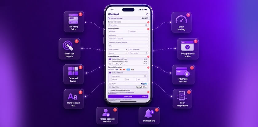
Too Many Checkout Fields
Long checkout forms make mobile users type more than they want to on a phone. Extra fields slow the process, increase form fatigue, and create more chances for shoppers to leave before placing the order.
Small Buttons And Tap Targets
Buttons and form controls that are too small can make checkout harder to use on touchscreens. Missed taps, accidental selections, and awkward spacing often create friction during the most important checkout actions.
Crowded Checkout Layout
Busy layouts make it harder for shoppers to follow the checkout flow on smaller screens. When sections feel cramped or unevenly stacked, users may struggle to understand where to look or what to do next.
Hard-To-Read Checkout Text
Small text and weak visual hierarchy make important details easier to miss on mobile devices. Billing labels, totals, payment instructions, and error messages should never force users to zoom in just to continue.
Slow Checkout Load Speed
A slow checkout page can quickly interrupt purchase intent on mobile. Heavy scripts, large media files, and extra plugins often increase waiting time and make shoppers more likely to abandon the process.
Popups Blocking Checkout Actions
Popups, sticky bars, and floating widgets can cover fields, buttons, or payment options on a phone screen. When important actions become harder to reach, checkout feels interrupted and less reliable.
Difficult Payment Experience
Payment sections that do not display properly on smaller screens can create confusion near the final step. Poorly fitted card fields, awkward gateway layouts, or extra steps often reduce checkout completion rates.
Weak Mobile Responsiveness
Responsive issues happen when checkout works on one screen size but breaks on another. Misaligned fields, overlapping sections, and horizontal scrolling can all make WooCommerce checkout harder to use across devices.
Forced Account Creation
Requiring account registration before purchase adds friction to an already limited mobile experience. Many shoppers prefer a faster path, and extra setup steps can delay or stop checkout completion.
Too Many Checkout Distractions
Extra banners, coupon prompts, support widgets, and promotional blocks can pull attention away from the final action. Mobile checkout works better when the page stays focused on completing the order clearly and quickly.
How to Make Your WooCommerce Checkout Page Mobile-Friendly?
Mobile users shop in a hurry and often on the go. They’re tapping with one thumb, not typing with both hands. That’s why your checkout needs to be short, clean, and fast. Below, you’ll find easy steps to make your WooCommerce checkout page work better on mobile.

Use A Single-Column Checkout Structure
Multi-column checkout sections often feel compressed on phones and can make the flow harder to follow. A single-column layout keeps each step in a natural top-to-bottom order, which makes checkout easier to scan and complete on smaller screens.
- Stack checkout sections in one vertical flow
- Avoid side-by-side fields that feel cramped on phones
- Keep billing, shipping, and payment sections in clear sequence
Add Better Spacing Between Checkout Sections
Tight spacing can make mobile checkout feel crowded, especially when form fields, labels, and totals sit too close together. Better spacing improves readability and helps shoppers understand where one part of checkout ends and the next begins.
- Add enough space between fields, headings, and buttons
- Separate order summary from form sections clearly
- Keep section spacing consistent across the page
Remove Visual Clutter From The Checkout Page
Extra design elements can compete with the actual checkout flow and make the page feel heavier on a small screen. Mobile layout works better when shoppers see only the content they need to complete the order.
- Remove sidebars from the checkout page
- Limit banners, promotional blocks, and extra messages
- Keep non-essential design elements away from the main form area
Keep Important Checkout Actions Easy To Reach
Mobile checkout layout performs best when it supports one goal: finishing the order smoothly. A cleaner structure with quick checkout for WooCommerce helps shoppers move from form completion to payment with less friction on smaller screens.
- Keep the main checkout button visually clear
- Place important actions close to the related section
- Avoid pushing key controls too far below unnecessary content
Organize Checkout Sections In A Logical Order
Confusing section order can make checkout feel longer than it actually is. A cleaner layout should follow the way shoppers naturally complete a purchase, from entering details to reviewing the order and finishing payment.
- Show customer information before payment
- Keep order review near the final action
- Avoid repeating information in multiple places
Make The Order Summary Easy To Review On Mobile
Order summary sections often become hard to scan when they are not adjusted properly for smaller screens. A mobile-friendly layout should let shoppers confirm products, totals, and charges without breaking the checkout flow.
- Keep product names and totals readable
- Avoid oversized summary boxes that dominate the screen
- Make shipping, tax, and final total easy to review
Prevent Layout Shifts During Checkout
Unexpected movement on the page can interrupt the checkout flow and make mobile users lose their place. Stable layout behavior helps shoppers stay focused while entering information and moving toward payment.
- Keep sections from jumping as fields load
- Avoid dynamic elements that push content unexpectedly
- Test coupons, validation messages, and payment changes for stability
Keep Checkout Focused On Completion
Mobile checkout layout performs best when it supports one goal: finishing the order smoothly. Pages with too many competing elements often slow users down and reduce completion rates.
- Prioritize checkout content over promotional content
- Keep support elements helpful but unobtrusive
- Design the page around fast completion, not extra browsing
Best Plugins and Tools to Help Make WooCommerce Checkout More Mobile-Friendly
Improving mobile WooCommerce checkout often requires more than design changes alone. The right plugin can shorten the purchase flow, reduce page reloads, simplify form handling, and make checkout easier to complete on smaller screens. Review these tools based on the exact part of mobile checkout you want to improve.
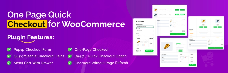
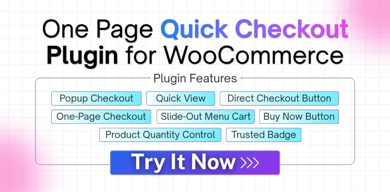
One Page Quick Checkout For WooCommerce
Stores that want fewer checkout steps on mobile can use this plugin to keep more of the purchase process in one place. That shorter flow can make WooCommerce single-page checkout for mobile shoppers feel easier to use for shoppers who want faster checkout without moving through extra pages.
WooCommerce Fast Cart
Mobile shoppers often lose momentum when they have to wait through separate cart and checkout page loads. A fast cart tool keeps cart actions closer to the current page, which can make quantity changes, cart review, and checkout access feel smoother on phones.
WooCommerce Direct Checkout
Extra steps between product selection and payment can create more drop-offs on small screens. This plugin helps reduce that friction by sending users closer to checkout right after the purchase action, which supports a quicker and more focused mobile buying path.
Flexible Checkout Fields
Long or poorly arranged forms can make checkout harder to complete on a phone. A checkout field plugin helps remove unnecessary fields, change field order, and keep the form more manageable for mobile users who need a shorter and cleaner checkout experience.
Mobile-Only Checkout Issues and How to Fix Them
Many stores face problems that only show up on mobile checkout pages. These issues can slow users down and stop them from buying. Small screens make tiny errors feel much bigger for shoppers. Read below to see common mobile checkout problems and learn how to fix them.
Checkout Fields Do Not Appear Properly on Mobile
Hidden or broken checkout fields can make the page look incomplete and stop shoppers from entering the information needed to finish the order. This can also contribute to multi-step checkout performance issues on mobile when users have to reload steps, go back, or repeat actions to complete the form.
Fix: Check the checkout page in mobile view, review theme and custom CSS rules, and confirm that required fields stay visible across common screen sizes. Test on real phones as well, not only in browser preview mode.
Sticky Headers Cover Important Checkout Actions
Large sticky headers can take up too much space on a phone screen and may overlap key actions like the Place Order button. When important controls are harder to reach, checkout becomes more frustrating to complete.
Fix: Reduce sticky header height on checkout pages or disable sticky behavior there entirely. Make sure the final action button stays visible, reachable, and unobstructed throughout the mobile checkout flow.
Popups Interrupt Form Completion
Promotional popups, floating offers, and overlay widgets can block checkout fields or pull attention away from the form. On mobile, even a small interruption can feel much more disruptive because screen space is already limited.
Fix: Disable popups on checkout-related pages and remove floating elements that overlap fields, totals, or payment actions. Keep the screen focused on completing the purchase without extra interruptions.
Payment Methods Do Not Display Well on Phones
Some payment sections load poorly on smaller screens or appear incomplete on slower mobile connections. That can create confusion at the final step and prevent shoppers from finishing the order.
Fix: Test each payment method on mobile devices, check how gateways load under slower conditions, and make sure payment buttons, card fields, and wallet options display correctly across common mobile browsers.
Layout Breaks Across Different Mobile Screens
Checkout may look fine on one device but feel broken on another because of uneven responsiveness. Misaligned fields, cramped sections, or sideways scrolling can all make the page harder to use.
Fix: Review checkout on different phone sizes, operating systems, and browsers. Adjust responsive spacing, section stacking, and field sizing so the layout stays stable across the devices your shoppers are most likely to use.
Checkout Feels Too Heavy for Mobile Users
Long forms, extra content blocks, and unnecessary page elements can make mobile checkout feel slower and harder to complete. Smaller screens work better when the path to payment stays short, clear, and focused.
Fix: Remove non-essential fields, reduce page clutter, and keep checkout content focused on billing, shipping, order review, and payment. A shorter, cleaner flow usually performs better on mobile.
Frequently Asked Questions
A checkout page that feels straightforward and easy to use is what mobile users want. On phones, a few minor adjustments can greatly streamline their purchasing process. The FAQs here share extra tips that were not covered earlier. Use them to improve your mobile checkout even more.
Why Should I Use Smaller Images On My Mobile Checkout Page?
Large images slow down load time and make the page feel heavy on phones. Smaller images help the page open faster and use less data, which keeps users from leaving too soon. Clear but light images still show needed details without hurting speed. This simple step can improve the full checkout flow.
How Can I Make My Checkout Page Easier To Read On Small Screens?
Use clear fonts, simple text, and enough spacing between each line so the content feels easy on the eyes. Avoid tiny text that forces users to zoom in, because this slows them down. A clean layout helps users stay focused and finish their order. Good spacing also reduces tapping mistakes.
What Is The Best Way To Reduce Typing On The Checkout Page?
You can use dropdowns, checkboxes, and simple choices to save time for mobile users. Typing on phones takes longer, so giving quick tap options helps more users complete checkout. Keep the form short and only show fields that matter. The less typing needed, the faster the checkout feels.
Why Should I Test My Checkout Page In Landscape Mode?
Many users turn their phones sideways when reading long lists or wide forms. Testing in landscape mode helps you spot layout issues you may miss in portrait mode. Some elements may move or overlap, causing confusion. Checking both views keeps the full page easy to use.
How Can I Make Coupon Fields Less Confusing On Mobile?
Coupon fields often distract users or make them feel like they are missing a discount. Hiding them behind a simple link keeps the page clean. Show the field only if users want to enter a code. This keeps the layout simple while still giving them the option.
Why Do Some Users Miss Required Fields On Phones?
Required fields can blend with other fields if the labels look too small. A simple mark or color change helps users see what must be filled. Phones have small screens, so clear signs are key. Good labels help cut mistakes and reduce checkout delays.
How Can I Improve Trust On A Mobile Checkout Page?
Show simple trust badges, clear payment signs, and short safety notes. Users feel safer when they know the site protects their data. Too many badges can look messy, so keep it clean and honest. A few clear trust signs help people finish their order with confidence.
Conclusion
Small changes can make a big difference in how people use your checkout on a phone. When the page feels simple, clean, and fast, more shoppers stay and finish their orders with ease.
If you follow the steps on how to make your WooCommerce checkout page mobile-friendly? You set your store up for better results. Keep testing, keep improving, and keep things easy for your users. A smoother checkout means happier buyers and more sales for your store.